部落格重構 Phase 1
Introduction
為了支援 SHOPLINE 的部落格重構 Phase 1,對於有開啟 Layout Engine的店家,需調整代碼以支援以下新功能:
- 新增部落格麵包屑
- 此文件異動,將由 SHOPLINE 統一為 Layout Engine 店家更新,您無需調整代碼,此處僅列出更新內容
- 套用 CKEditor 5 樣式
- 優化部落格圖片載入效能 (image lazyload、隨螢幕寬度展示對應圖片大小、減少 mobile 端下載圖片的大小)
1. 新增部落格麵包屑
A. 配置 Locales
en.json
步驟一:找出要修改的程式碼
找到以下 JSON 開頭是 "products": { ... } 的區塊
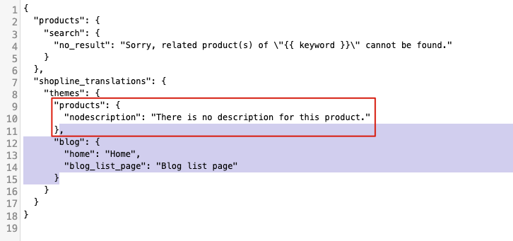
步驟二:將找到的 "products": { ... } 區塊下面加入以下 JSON
,
"blog": {
  "home": "Home",
  "blog_list_page": "Blog list page"
}
vi.json
沒有 vi.json 語系檔案可跳過以下步驟
步驟一:找出要修改的程式碼
找到以下 JSON 開頭是 "products": { ... } 的區塊
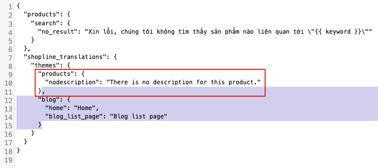
步驟二:將找到的 "products": { ... } 區塊下面加入以下 JSON
,
"blog": {
  "home": "Home",
  "blog_list_page": "Blog list page"
}
zh-hant.json
步驟一:找出要修改的程式碼
找到以下 JSON 開頭是 "products": { ... } 的區塊
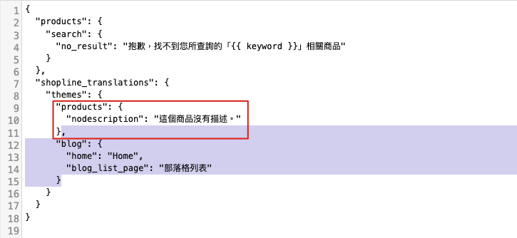
步驟二:將找到的 "products": { ... } 區塊下面加入以下 JSON
,
"blog": {
  "home": "Home",
  "blog_list_page": "部落格列表"
}
B. 新增 blog_breadcrumb.liquid
<div class="blog-breadcrumb">
  <div class="block-inner">
    <a class="Label" href="{{ root_url }}">{{ 'shopline_translations.themes.blog.home' | translate }}</a>
    / <a class="Label" href="/blog/posts">{{ 'shopline_translations.themes.blog.blog_list_page' | translate }}</a>
    {% unless posts %}
    / <span class="Label">{{ post.title }}</span>
    {% endunless %}
  </div>
</div>

{% style %}
  body.posts .blog-breadcrumb {
    background-color: #F7F7F7;
    color: #999;
    font-size: 13px;
  }
  body.posts .blog-breadcrumb .block-inner {
    width: 1400px;
    max-width: 100%;
    margin: 0 auto;
    padding: 10px 20px;
  }
  body.posts .blog-breadcrumb .block-inner .Label {
    color: #999;
    position: relative;
  }
  body.posts .blog-breadcrumb .block-inner .Label:after {
    content: "";
    position: absolute;
    left: 50%;
    right: 50%;
    bottom: -3px;
    border-bottom-width: 2px;
    border-bottom-style: solid;
  }
  body.posts .blog-breadcrumb .block-inner .Label:hover:after {
    left: 0;
    right: 0;
  }
{% endstyle %}
2. 套用 CKEditor 5 樣式
A. 更新 post.liquid
步驟一:找到<div class="Post-content">{{ post.content }}</div>的程式碼
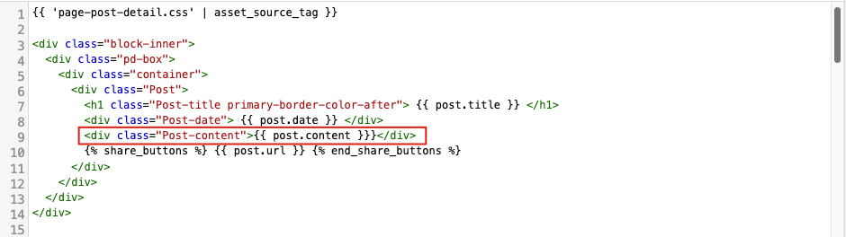
步驟二:將其改成下列程式碼
<div class="Post-content">
  {% assign rich_content_body = post.content %}
	{% include 'rich_content' %}
</div>
步驟三:請到文件底部
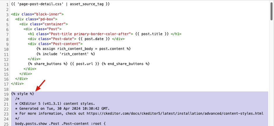
步驟四:新增這段支援 CKEditor 5 樣式的 CSS
{% style %}
  /*
  * CKEditor 5 (v41.3.1) content styles.
  * Generated on Tue, 30 Apr 2024 10:30:42 GMT.
  * For more information, check out https://ckeditor.com/docs/ckeditor5/latest/installation/advanced/content-styles.html
  */
  body.posts.show .Post .Post-content :root {
    --ck-color-image-caption-background: hsl(0, 0%, 97%);
    --ck-color-image-caption-text: hsl(0, 0%, 20%);
    --ck-color-mention-background: hsla(341, 100%, 30%, 0.1);
    --ck-color-mention-text: hsl(341, 100%, 30%);
    --ck-color-selector-caption-background: hsl(0, 0%, 97%);
    --ck-color-selector-caption-text: hsl(0, 0%, 20%);
    --ck-image-style-spacing: 1.5em;
    --ck-inline-image-style-spacing: calc(var(--ck-image-style-spacing) / 2);
  }
  body.posts.show .Post .Post-content .table > figcaption {
    display: table-caption;
    caption-side: top;
    word-break: break-word;
    text-align: center;
    color: var(--ck-color-selector-caption-text);
    background-color: var(--ck-color-selector-caption-background);
    padding: 0.6em;
    font-size: 0.75em;
    outline-offset: -1px;
  }
  body.posts.show .Post .Post-content .table .ck-table-resized {
    table-layout: fixed;
  }
  body.posts.show .Post .Post-content .table table {
    overflow: hidden;
  }
  body.posts.show .Post .Post-content .table td,
  body.posts.show .Post .Post-content .table th {
    overflow-wrap: break-word;
    position: relative;
  }
  body.posts.show .Post .Post-content .table {
    margin: 0.9em auto;
    display: table;
  }
  body.posts.show .Post .Post-content .table table {
    border-collapse: collapse;
    border-spacing: 0;
    width: 100%;
    height: 100%;
    border: 1px double hsl(0, 0%, 70%);
  }
  body.posts.show .Post .Post-content .table table td,
  body.posts.show .Post .Post-content .table table th {
    min-width: 2em;
    padding: 0.4em;
    border: 1px solid hsl(0, 0%, 75%);
  }
  body.posts.show .Post .Post-content .table table th {
    font-weight: bold;
    background: hsla(0, 0%, 0%, 0.05);
  }
  body.posts.show .Post .Post-content[dir=rtl] .table th {
    text-align: right;
  }
  body.posts.show .Post .Post-content[dir=ltr] .table th {
    text-align: left;
  }
  body.posts.show .Post .Post-content .media {
    clear: both;
    margin: 0.9em 0;
    display: block;
    min-width: 15em;
  }
  body.posts.show .Post .Post-content img.image_resized {
    height: auto;
  }
  body.posts.show .Post .Post-content .image.image_resized {
    max-width: 100%;
    display: block;
    box-sizing: border-box;
  }
  body.posts.show .Post .Post-content .image.image_resized img {
    width: 100%;
  }
  body.posts.show .Post .Post-content .image.image_resized > figcaption {
    display: block;
  }
  body.posts.show .Post .Post-content .image {
    display: table;
    clear: both;
    text-align: center;
    margin: 0.9em auto;
    min-width: 50px;
  }
  body.posts.show .Post .Post-content .image img {
    display: block;
    margin: 0 auto;
    max-width: 100%;
    min-width: 100%;
    height: auto;
  }
  body.posts.show .Post .Post-content .image-inline {
    /*
      * Normally, the .image-inline would have "display: inline-block" and "img { width: 100% }" (to follow the wrapper while resizing).;
      * Unfortunately, together with "srcset", it gets automatically stretched up to the width of the editing root.
      * This strange behavior does not happen with inline-flex.
      */
    display: inline-flex;
    max-width: 100%;
    align-items: flex-start;
  }
  body.posts.show .Post .Post-content .image-inline picture {
    display: flex;
  }
  body.posts.show .Post .Post-content .image-inline picture,
  body.posts.show .Post .Post-content .image-inline img {
    flex-grow: 1;
    flex-shrink: 1;
    max-width: 100%;
  }
  body.posts.show .Post .Post-content .image > figcaption {
    display: table-caption;
    caption-side: bottom;
    word-break: break-word;
    color: var(--ck-color-image-caption-text);
    background-color: var(--ck-color-image-caption-background);
    padding: 0.6em;
    font-size: 0.75em;
    outline-offset: -1px;
  }
  body.posts.show .Post .Post-content ol {
    list-style-type: decimal;
  }
  body.posts.show .Post .Post-content ol ol {
    list-style-type: lower-latin;
  }
  body.posts.show .Post .Post-content ol ol ol {
    list-style-type: lower-roman;
  }
  body.posts.show .Post .Post-content ol ol ol ol {
    list-style-type: upper-latin;
  }
  body.posts.show .Post .Post-content ol ol ol ol ol {
    list-style-type: upper-roman;
  }
  body.posts.show .Post .Post-content ul {
    list-style-type: disc;
  }
  body.posts.show .Post .Post-content ul ul {
    list-style-type: circle;
  }
  body.posts.show .Post .Post-content ul ul ul {
    list-style-type: square;
  }
  body.posts.show .Post .Post-content ul ul ul ul {
    list-style-type: square;
  }
  body.posts.show .Post .Post-content ul,
  body.posts.show .Post .Post-content ol {
    padding: 0;
    margin: 0;
    padding-inline-start: 40px;
  }
  body.posts.show .Post .Post-content .image-style-block-align-left,
  body.posts.show .Post .Post-content .image-style-block-align-right {
    max-width: calc(100% - var(--ck-image-style-spacing));
  }
  body.posts.show .Post .Post-content .image-style-align-left,
  body.posts.show .Post .Post-content .image-style-align-right {
    clear: none;
  }
  body.posts.show .Post .Post-content .image-style-side {
    float: right;
    margin-left: var(--ck-image-style-spacing);
    max-width: 50%;
  }
  body.posts.show .Post .Post-content .image-style-align-left {
    float: left;
    margin-right: var(--ck-image-style-spacing);
  }
  body.posts.show .Post .Post-content .image-style-align-center {
    margin-left: auto;
    margin-right: auto;
  }
  body.posts.show .Post .Post-content .image-style-align-right {
    float: right;
    margin-left: var(--ck-image-style-spacing);
  }
  body.posts.show .Post .Post-content .image-style-block-align-right {
    margin-right: 0;
    margin-left: auto;
  }
  body.posts.show .Post .Post-content .image-style-block-align-left {
    margin-left: 0;
    margin-right: auto;
  }
  body.posts.show .Post .Post-content p + .image-style-align-left,
  body.posts.show .Post .Post-content p + .image-style-align-right,
  body.posts.show .Post .Post-content p + .image-style-side {
    margin-top: 0;
  }
  body.posts.show .Post .Post-content .image-inline.image-style-align-left,
  body.posts.show .Post .Post-content .image-inline.image-style-align-right {
    margin-top: var(--ck-inline-image-style-spacing);
    margin-bottom: var(--ck-inline-image-style-spacing);
  }
  body.posts.show .Post .Post-content .image-inline.image-style-align-left {
    margin-right: var(--ck-inline-image-style-spacing);
  }
  body.posts.show .Post .Post-content .image-inline.image-style-align-right {
    margin-left: var(--ck-inline-image-style-spacing);
  }
  body.posts.show .Post .Post-content code {
    background-color: hsla(0, 0%, 78%, 0.3);
    padding: 0.15em;
    border-radius: 2px;
    color: inherit;
  }
  body.posts.show .Post .Post-content .text-tiny {
    font-size: 0.7em;
  }
  body.posts.show .Post .Post-content .text-small {
    font-size: 0.85em;
  }
  body.posts.show .Post .Post-content .text-big {
    font-size: 1.4em;
  }
  body.posts.show .Post .Post-content .text-huge {
    font-size: 1.8em;
  }
{% endstyle %}
B. 更新 rich_style.liquid
步驟一:如果你的商店沒有 rich_content.liquid 檔案,請複製以下程式碼到代碼片段新增檔案,有的話則跳過此步驟
{% capture custom_html %}
  <style>
    {% include 'rich_style' %}
  </style>
{% endcapture %}

{{ rich_content_body | rich_content_format:
  custom_html: custom_html,
}}
步驟二:如果你的商店沒有 rich_style.liquid 檔案,請複製以下程式碼到代碼片段新增檔案,有的話則跳過此步驟
h1, h2, h3, h4, h5, h6 {
  font-weight: 500;
  padding: 0;
  margin: 0;
  text-align: inherit;
  text-transform: none;
  font-family: inherit;
}
h1 {
  text-transform: uppercase;
  font-size: calc(28px * var(--font-size-paragraph, 1));
  line-height: 1.24;
  margin-top: 20px;
}
h2 {
  font-size: calc(32px * var(--font-size-paragraph, 1));
  padding: 10px 0px 20px 0px;
}
h1, h2 {
  padding: 10px 0px 20px 0px;
  margin-bottom: 0px;
  letter-spacing: 2px;
}
h3 {
  font-size: calc(24px * var(--font-size-paragraph, 1));
}
h4 {
  font-size: calc(18px * var(--font-size-paragraph, 1));
}
h5 {
  font-size: calc(16px * var(--font-size-paragraph, 1));
}
h6 {
  font-size: calc(13px * var(--font-size-paragraph, 1))
}
p {
  margin: 0;
  padding: 0;
  line-height: 20px;
}
ul, ol {
  list-style-position: outside;
  padding-left: 40px;
  margin: 0 0 10px 0;
}
ul ul, ul ol, ol ul, ol ol {
  margin: 0;
}
a {
  text-decoration: none;
  color: #337ab7;
}
img, iframe {
  max-width: 100%;
}
img {
  vertical-align: middle;
}
table {
  border-collapse: collapse;
  border-spacing: 0;
}
th {
  text-align: left;
}
td, th {
  padding: 0;
}
hr {
  height: 0;
  margin-top: 20px;
  margin-bottom: 20px;
  border: 0;
  border-top: 1px solid #eeeeee;
  border-color: hsla(var(--page-background-h, 0deg), var(--page-background-s, 0%), 80%, 0.5);
}
.ck-video-widget, .responsive-video {
  position: relative;
}
.responsive-container {
  display: block;
  width: 100%;
  height: auto;
  padding: 28%;
}
.res-iframe iframe {
  position: absolute;
  top: 0;
  left: 0;
  width: 100%;
  height: 100%;
}
{% if page.identifier == 'text_page' or page.identifier == '' %}
  a {
    color: var(--page-text-link, #3493fb);
  }
  p {
    line-height: 25px;
  }
  h1 {
    font-weight: inherit;
    font-weight: 28px;
  }
  ul, ol {
    padding-left: 56px;
    margin-bottom: 0;
  }
{% endif %}
{% if page.identifier == 'post_detail' %}
  * {
    line-height: 1.5;
  }
  p {
    margin-bottom: 20px;
    line-height: 1.5;
  }
  ol {
    margin: 15px 15px 15px 0;
  }
  ul {
    padding-left: 40px;
  }
  ul ul, ol ul, ul ol, ol ol {
    margin-top: 0;
    margin-bottom: 0;
  }
  a {
    color: var(--page-text-link, #3493fb);
  }
  h1, h2, h3, h4, h5, h5, h6 {
    line-height: inherit;
  }
  h1 {
    font-weight: inherit;
    font-size: 28px;
  }
{% endif %}
{% if page.identifier == 'product_detail' %}
  h1 {
    font-weight: inherit;
    font-size: 28px;
  }
{% endif %}
步驟三:請到 rich_style.liquid 檔案底部
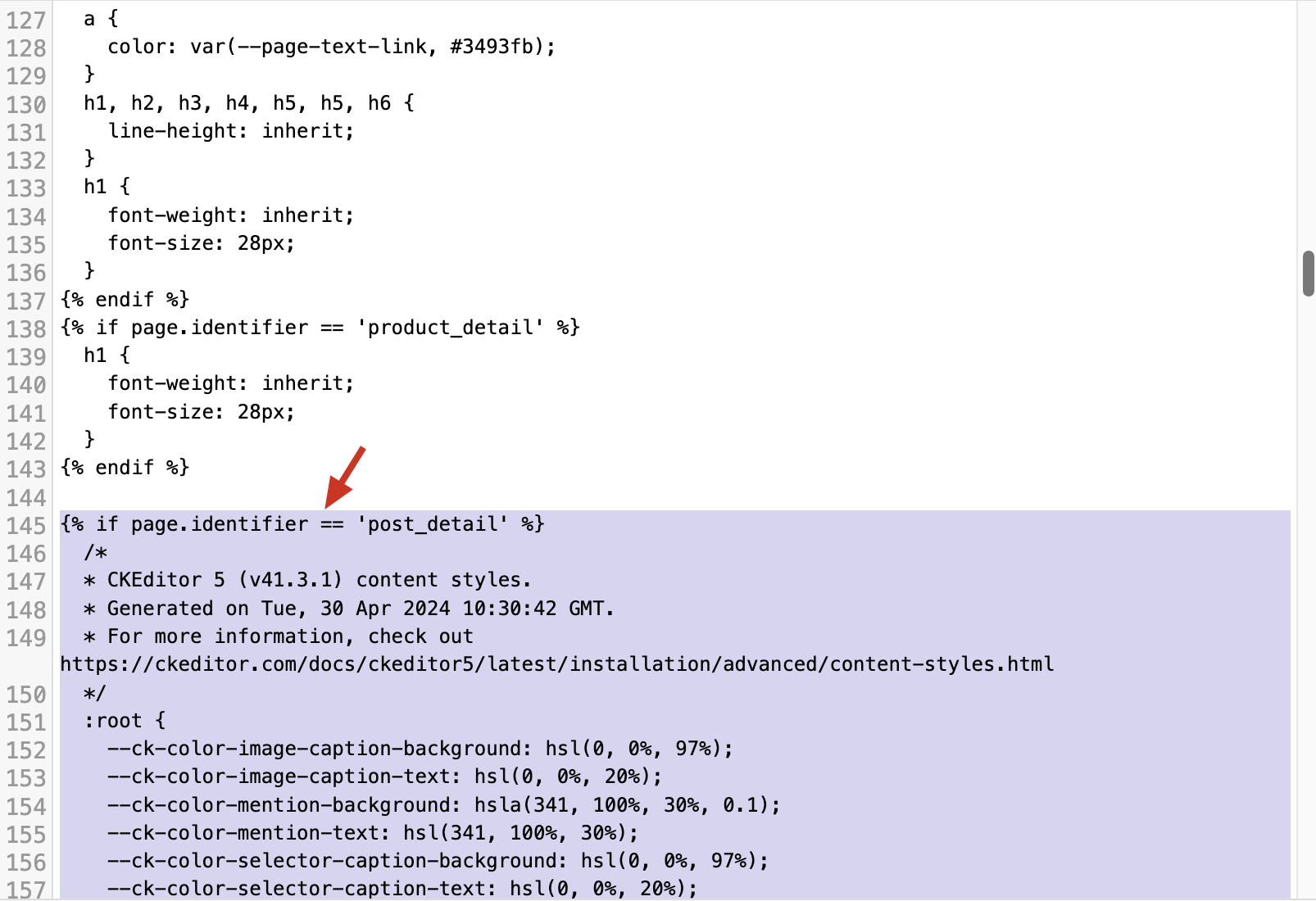
步驟四:新增這段支援 CKEditor 5 樣式的 CSS
{% if page.identifier == 'post_detail' %}
  /*
  * CKEditor 5 (v41.3.1) content styles.
  * Generated on Tue, 30 Apr 2024 10:30:42 GMT.
  * For more information, check out https://ckeditor.com/docs/ckeditor5/latest/installation/advanced/content-styles.html
  */
  :root {
    --ck-color-image-caption-background: hsl(0, 0%, 97%);
    --ck-color-image-caption-text: hsl(0, 0%, 20%);
    --ck-color-mention-background: hsla(341, 100%, 30%, 0.1);
    --ck-color-mention-text: hsl(341, 100%, 30%);
    --ck-color-selector-caption-background: hsl(0, 0%, 97%);
    --ck-color-selector-caption-text: hsl(0, 0%, 20%);
    --ck-image-style-spacing: 1.5em;
    --ck-inline-image-style-spacing: calc(var(--ck-image-style-spacing) / 2);
  }

  /* @ckeditor/ckeditor5-table/theme/tablecaption.css */
  .table>figcaption {
    display: table-caption;
    caption-side: top;
    word-break: break-word;
    text-align: center;
    color: var(--ck-color-selector-caption-text);
    background-color: var(--ck-color-selector-caption-background);
    padding: .6em;
    font-size: .75em;
    outline-offset: -1px;
  }

  /* @ckeditor/ckeditor5-table/theme/tablecolumnresize.css */
  .table .ck-table-resized {
    table-layout: fixed;
  }

  /* @ckeditor/ckeditor5-table/theme/tablecolumnresize.css */
  .table table {
    overflow: hidden;
  }

  /* @ckeditor/ckeditor5-table/theme/tablecolumnresize.css */
  .table td,
  .table th {
    overflow-wrap: break-word;
    position: relative;
  }

  /* @ckeditor/ckeditor5-table/theme/table.css */
  .table {
    margin: 0.9em auto;
    display: table;
    /* bootstrap 3 table css */
    width: 100%;
  }

  /* @ckeditor/ckeditor5-table/theme/table.css */
  .table table {
    border-collapse: collapse;
    border-spacing: 0;
    width: 100%;
    height: 100%;
    border: 1px double hsl(0, 0%, 70%);
  }

  /* @ckeditor/ckeditor5-table/theme/table.css */
  .table table td,
  .table table th {
    min-width: 2em;
    padding: .4em;
    border: 1px solid hsl(0, 0%, 75%);
  }

  /* @ckeditor/ckeditor5-table/theme/table.css */
  .table table th {
    font-weight: bold;
    background: hsla(0, 0%, 0%, 5%);
  }

  /* @ckeditor/ckeditor5-table/theme/table.css */
  &[dir="rtl"] .table th {
    text-align: right;
  }

  /* @ckeditor/ckeditor5-table/theme/table.css */
  &[dir="ltr"] .table th {
    text-align: left;
  }

  /* @ckeditor/ckeditor5-media-embed/theme/mediaembed.css */
  .media {
    clear: both;
    margin: 0.9em 0;
    display: block;
    min-width: 15em;
  }

  /* @ckeditor/ckeditor5-image/theme/imageresize.css */
  img.image_resized {
    height: auto;
  }

  /* @ckeditor/ckeditor5-image/theme/imageresize.css */
  .image.image_resized {
    max-width: 100%;
    display: block;
    box-sizing: border-box;
  }

  /* @ckeditor/ckeditor5-image/theme/imageresize.css */
  .image.image_resized img {
    width: 100%;
  }

  /* @ckeditor/ckeditor5-image/theme/imageresize.css */
  .image.image_resized>figcaption {
    display: block;
  }

  /* @ckeditor/ckeditor5-image/theme/image.css */
  .image {
    display: table;
    clear: both;
    text-align: center;
    margin: 0.9em auto;
    min-width: 50px;
  }

  /* @ckeditor/ckeditor5-image/theme/image.css */
  .image img {
    display: block;
    margin: 0 auto;
    max-width: 100%;
    min-width: 100%;
    height: auto;
  }

  /* @ckeditor/ckeditor5-image/theme/image.css */
  .image-inline {
    /*
      * Normally, the .image-inline would have "display: inline-block" and "img { width: 100% }" (to follow the wrapper while resizing).;
      * Unfortunately, together with "srcset", it gets automatically stretched up to the width of the editing root.
      * This strange behavior does not happen with inline-flex.
      */
    display: inline-flex;
    max-width: 100%;
    align-items: flex-start;
  }

  /* @ckeditor/ckeditor5-image/theme/image.css */
  .image-inline picture {
    display: flex;
  }

  /* @ckeditor/ckeditor5-image/theme/image.css */
  .image-inline picture,
  .image-inline img {
    flex-grow: 1;
    flex-shrink: 1;
    max-width: 100%;
  }

  /* @ckeditor/ckeditor5-image/theme/imagecaption.css */
  .image>figcaption {
    display: table-caption;
    caption-side: bottom;
    word-break: break-word;
    color: var(--ck-color-image-caption-text);
    background-color: var(--ck-color-image-caption-background);
    padding: .6em;
    font-size: .75em;
    outline-offset: -1px;
  }

  /* @ckeditor/ckeditor5-list/theme/list.css */
  ol {
    list-style-type: decimal;
  }

  /* @ckeditor/ckeditor5-list/theme/list.css */
  ol ol {
    list-style-type: lower-latin;
  }

  /* @ckeditor/ckeditor5-list/theme/list.css */
  ol ol ol {
    list-style-type: lower-roman;
  }

  /* @ckeditor/ckeditor5-list/theme/list.css */
  ol ol ol ol {
    list-style-type: upper-latin;
  }

  /* @ckeditor/ckeditor5-list/theme/list.css */
  ol ol ol ol ol {
    list-style-type: upper-roman;
  }

  /* @ckeditor/ckeditor5-list/theme/list.css */
  ul {
    list-style-type: disc;
  }

  /* @ckeditor/ckeditor5-list/theme/list.css */
  ul ul {
    list-style-type: circle;
  }

  /* @ckeditor/ckeditor5-list/theme/list.css */
  ul ul ul {
    list-style-type: square;
  }

  /* @ckeditor/ckeditor5-list/theme/list.css */
  ul ul ul ul {
    list-style-type: square;
  }

  /* @ckeditor/ckeditor5-image/theme/imagestyle.css */
  .image-style-block-align-left,
  .image-style-block-align-right {
    max-width: calc(100% - var(--ck-image-style-spacing));
  }

  /* @ckeditor/ckeditor5-image/theme/imagestyle.css */
  .image-style-align-left,
  .image-style-align-right {
    clear: none;
  }

  /* @ckeditor/ckeditor5-image/theme/imagestyle.css */
  .image-style-side {
    float: right;
    margin-left: var(--ck-image-style-spacing);
    max-width: 50%;
  }

  /* @ckeditor/ckeditor5-image/theme/imagestyle.css */
  .image-style-align-left {
    float: left;
    margin-right: var(--ck-image-style-spacing);
  }

  /* @ckeditor/ckeditor5-image/theme/imagestyle.css */
  .image-style-align-center {
    margin-left: auto;
    margin-right: auto;
  }

  /* @ckeditor/ckeditor5-image/theme/imagestyle.css */
  .image-style-align-right {
    float: right;
    margin-left: var(--ck-image-style-spacing);
  }

  /* @ckeditor/ckeditor5-image/theme/imagestyle.css */
  .image-style-block-align-right {
    margin-right: 0;
    margin-left: auto;
  }

  /* @ckeditor/ckeditor5-image/theme/imagestyle.css */
  .image-style-block-align-left {
    margin-left: 0;
    margin-right: auto;
  }

  /* @ckeditor/ckeditor5-image/theme/imagestyle.css */
  p+.image-style-align-left,
  p+.image-style-align-right,
  p+.image-style-side {
    margin-top: 0;
  }

  /* @ckeditor/ckeditor5-image/theme/imagestyle.css */
  .image-inline.image-style-align-left,
  .image-inline.image-style-align-right {
    margin-top: var(--ck-inline-image-style-spacing);
    margin-bottom: var(--ck-inline-image-style-spacing);
  }

  /* @ckeditor/ckeditor5-image/theme/imagestyle.css */
  .image-inline.image-style-align-left {
    margin-right: var(--ck-inline-image-style-spacing);
  }

  /* @ckeditor/ckeditor5-image/theme/imagestyle.css */
  .image-inline.image-style-align-right {
    margin-left: var(--ck-inline-image-style-spacing);
  }

  /* @ckeditor/ckeditor5-basic-styles/theme/code.css */
  code {
    background-color: hsla(0, 0%, 78%, 0.3);
    padding: .15em;
    border-radius: 2px;
  }

  /* @ckeditor/ckeditor5-font/theme/fontsize.css */
  .text-tiny {
    font-size: .7em;
  }

  /* @ckeditor/ckeditor5-font/theme/fontsize.css */
  .text-small {
    font-size: .85em;
  }

  /* @ckeditor/ckeditor5-font/theme/fontsize.css */
  .text-big {
    font-size: 1.4em;
  }

  /* @ckeditor/ckeditor5-font/theme/fontsize.css */
  .text-huge {
    font-size: 1.8em;
  }

  /* Add global styles */
  dt {
  	font-weight: 700;
  }
{% endif %}
3. 優化部落格圖片載入效能
A. 取代 posts.liquid 的過時語法
步驟一:找到<div class="List-item-excerpt js-list-item-excerpt">{{ post.excerpt }}</div>
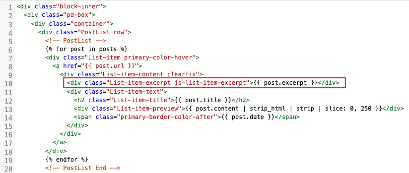
步驟二:取代成以下這段 liquid
<div class="List-item-excerpt js-list-item-excerpt">
  {% if post.thumbnail_info != blank %}
    {{ post.thumbnail_info.url | image_tag: use_lazysizes: true, widths: '200, 400, 600, 800', alt: post.thumbnail_info.alt }}
  {% endif %}
</div>
Updated about 2 months ago